The best brand palettes don’t always start in Photoshop — they start with a fig. Or a shadow on a linen sheet. Or a half-smeared lipstick on porcelain.
In today’s branding world, it’s not enough to “pick colors.” You have to pull them — from real, tactile, beautiful things. That’s where the magic happens. That’s how you build a brand that feels alive.
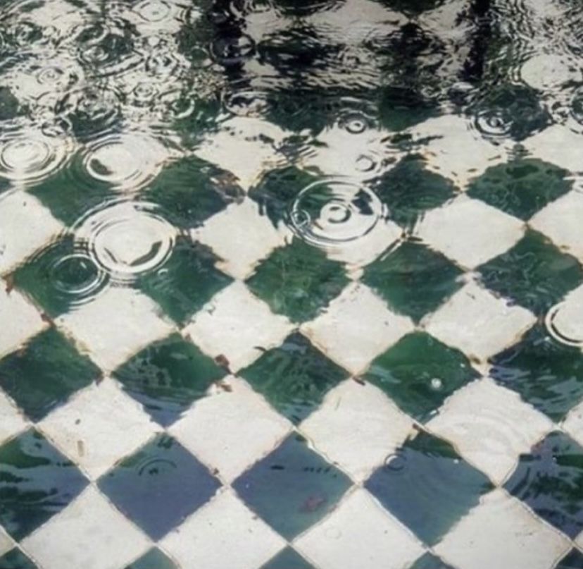
Take the image above: figs, cracked open and glistening. At first glance, it’s just fruit. But look again — it’s an entire color story. Deep oxblood, warm terracotta, sun-faded mustard, olive green, soft taupe. Paired together, they whisper luxury, sensuality, earthiness. It’s not just aesthetic — it’s emotional.
Why pulling color from imagery works:
It creates an emotional anchor
Colors that come from real life — food, nature, architecture — hit differently. They’re grounded in the physical world, which makes your brand feel warmer, more tactile, and more human. A burgundy pulled from a fig feels richer than one picked randomly from a swatch library.
It builds depth and texture
When you pull from a photo, you're not just grabbing a flat hex code — you're capturing context. A brand that builds its palette from ceramics, coffee, foliage, or textiles automatically inherits the depth and materiality of those things. It’s branding that you can feel, not just see.
It elevates storytelling
Let’s say you’re branding a wellness cafe. You could go with clean white and “plant green” — or you could build a palette pulled from matcha foam, ceramic mugs, pistachio cream, and morning sunlight. Suddenly your brand has a story, a mood, a place in someone’s imagination.
How to do it:
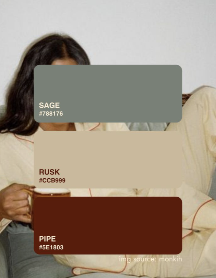
- Start with images, not swatches. Gather photos that feel like your brand — not just logos, but interiors, food, nature, people.
- Use tools like Adobe Color, Canva, or even eyedropper browser extensions to extract tones from those images.
- Play with contrast. Pull both your “hero” shades (bold, rich) and your “supporting” tones (neutrals, textures).
- Think texture too. Is your brand glossy or matte? Crunchy or soft? These decisions will influence the type of visuals and materials you use — from packaging to photo styling.
In a world full of brands fighting for attention, the ones that win aren’t just pretty — they’re sensory.
They feel specific, thoughtful, and rooted in something real. So next time you’re building a brand — don’t start with the swatches. Start with a fig. Or a sunset. Or a chipped plate at your favorite café.
Start with feeling. Then build the palette around it.